
THE PRODUCT
A visual editor that keeps the website real.
Begin from a blank canvas, an approved strategy, or a design reference. Every route leads to native sections, responsive controls, interactions, reusable systems, and code you can keep shaping.
Add
Pages
Assets
Styles
EDITABLE SECTION
Make the layout your own.
Layout
Content
INSPECTOR
Layout
Spacing
Type
Effects
Code
Editable product model · not a fabricated product screenshot
THREE WAYS IN
Start where the work starts.
Choose the level of direction that matches the project. The result still belongs to the same native editor.
01
Blank canvas
Design directly
Compose native sections, responsive grids, typography, colors, effects, and interactions with precise visual controls.
Result: editable native project
02
Approved strategy
Website Director
Move through brief, sitemap, copy, visual direction, and approval checkpoints into a native draft you can keep editing.
Result: editable native project
03
Owned reference
Image Build + Design IR
Use a section or page design you have the right to use, then rebuild it as responsive native structure with comparison evidence.
Result: editable native project
THE EDITABLE CORE
Everything important stays available after the first draft.
Alora is built around a normal website project you can inspect, change, reuse, review, and publish—not a one-shot answer.
STRUCTURE
Native building blocks
Sections, blocks, text, media, forms, navigation, galleries, and code remain real project nodes—not a flattened image.
STYLE
Systems, not one-offs
Typography roles, color roles, section styles, and reusable libraries help a site stay consistent while it grows.
BEHAVIOR
Motion with control
Add interactions and effects through the editor, then review the result without giving customer scripts access to the editor itself.
EXTENSION
Go past the visual controls
Use custom HTML, CSS, and JavaScript extension points when a project needs behavior beyond the built-in tools.
RESPONSIVE BY DESIGN
Design the change between screens—not just a smaller desktop.
Move through wide, desktop, laptop, tablet, and mobile modes. Review layout, spacing, type, visibility, and stacking where each decision matters.
✓ Five editing modes
✓ Per-breakpoint layout and spacing
✓ Visibility and stacking control
✓ Review before launch
ONE PAGE · PURPOSEFUL CHANGES
WIDE
DESKTOP
LAPTOP
TABLET
MOBILE
MORE THAN A PAGE CANVAS
Build the system around the website, too.
The same workspace carries design rules, reusable pieces, content foundations, interactions, and the extension points needed for advanced work.
01
Design systems
Typography roles, color roles, reusable section styles, and personal or shared libraries.
02
Interactions and effects
Build motion and interaction behavior visually, then review it inside the guarded editor preview.
03
Content and operations
Forms and Inbox, blog/content foundations, and small-store commerce stay part of the website project.
04
Custom-code extension
Add custom HTML, CSS, and JavaScript when the built-in tools are not the last mile.
ONE FOUNDATION, DIFFERENT VOICES
The toolset stays familiar. The design does not have to.
Use the same editable foundation for service, hospitality, commerce, community, content, and portfolio work.
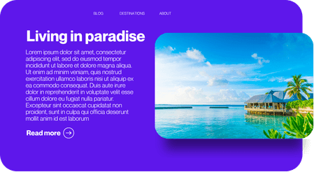
Resort direction
A saved visual direction for a hospitality landing page.

Commerce direction
A saved visual direction for an editorial storefront.
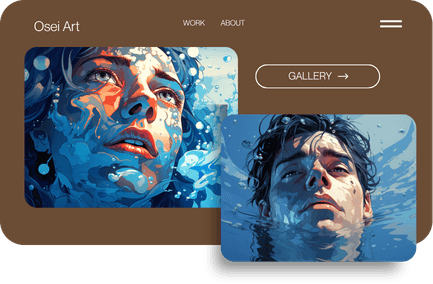
Portfolio direction
A saved visual direction for an artist portfolio.
These are saved design examples from Alora’s project library—not customer testimonials or claims about live client results.
THE WEBSITE CAN KEEP MOVING
Review every breakpoint. Publish. Improve. Republish.
Use Alora Hosting for a connected publishing path, or unlock reusable static HTML export for the site you are handing off.
START WHERE YOU ARE
Use guidance when you need it. Keep control when you do not.
Alora is designed to help a beginner find direction, a designer work precisely, and a developer extend the result without changing platforms.